Friday, December 3, 2010

Christina as a giggly ball of supernatural essence... texting silliness :)

Okay, Chad, here it is... me, myself and I in the form of a giggling incandescent violet orb with festive jingle bells hovering over your right shoulder... hope it makes you smile!

Monday, November 15, 2010

People, puppies and friends!

Okay, here are some more people... and a puppy for good measure. You may recognize a few faces, although Annelise doesn't really look like Annelise. I miss you guys. Anyway, these represent me still working things out and experimenting. We'll see where it all leads, but in the mean time I'm having fun with it. More to come soon... I'm working on a larger scale, finished piece now as well as additional sketches.


Friday, October 29, 2010

Experiments...

Recently I've been experimenting with evolving my style. I feel like my work has gotten way too "tight" and restrictive... stiff and stale. Not to mention that it takes me forever to finish a piece anymore because of my insistence on sticking to my graphite, watercolor, colored pencil and ink process. So here are some new things I've been trying out in my sketchbook. They're just the first baby steps, but, as always, I'd love to know what y'all think. Don't forget to click on the pictures so you can see the detail!


Sunday, October 24, 2010

Hall of Heros

So here it is. Long delayed, but without further ado.

Tuesday, October 12, 2010

Friday, September 24, 2010

Monday, September 20, 2010

Value/Color comp


Ok guys, whaddayah think? I'm unsure. I feel like it needs more color. But I dunno. Thoughts please.

Thursday, September 16, 2010

I drew these guys a while back and have been meaning to post them, so here you go. There was no particular rhyme or reason behind the creation of these characters, I just started doodling large-eyed people with funny ears. Some of them turned out better than others. Enjoy!


Wednesday, September 15, 2010

I'm not slacking anymore... for the moment anyway!

Okay. I got up off my lazy butt and finally posted this (thanks for the motivation Brendan). So here's the deal. I've been commissioned by a girl to do a landscape tryptic for her to hang in her apartment. It's a purely decorative, fine art type thing. The finished pieces will be 16" x 20" each. She wants strictly landscape with no animals or man-made structures. The mood/atmosphere should be calming, peaceful, relaxing, etc. and the color scheme is to be teal, robin's egg blue, browns and creams (so non-representative color). She didn't really know what type of landscape she wanted or what area of the world she would prefer, so I have total freedom as far as that goes.

The first piece was inspired by some photos I took in Alaska of rocks and cliffs coming out of the ocean, so it's technically a seascape? I imagine I'll have fun with the rock formations and different textures of moss and scrub if I take this one to finish. I also think that the twisty pine trees will be interesting to draw.
The second sketch is an African landscape with a cool baobab tree as the focal point in the foreground and some interesting rock formations/ cliffs in the background. The patterned border stuff is a giraffe pattern. The girl that this is for mentioned that she loves giraffes and giraffe patterned things and suggested that she might like to incorporate that into the pictures somehow. This was my solution. Anyway, I think I'm gonna try and make the baobab tree "twistier" and have it break up the space in a more interesting way (play with positive and negative shapes) so that is seems more dynamic and not so static and "lump-like" in the foreground.
So there they are. I'm sending them to the girl to get her opinions and see which direction she would like to go in, but I need your thoughts too! Any critiques, ideas or suggestions will be welcome as always.

I miss and love you all and I WILL be posting some more random stuff tomorrow :)

From Thumb to Sketch!

So here is the drawing of the thumbnail you guys suggested I do. Yeah, took me forever. I gotta get my chops back. But I'm liking how it turned out.

Requesting crit. What looks weird that I cant see after emblazoning this image on my retinas?


After making any suggested adjustments I concur with, I'm going to do a rough digital color comp and post that. Then onto final paints!

And, bonus art! ...

Awhile ago this trailer for a French animated series was posted on Drawn.ca, one of my favorite illustration blogs, and I totally fell in love and had an eye-gasam.

Watch I now. I'll wait.

I did a fan art of it. I know right?
Luff you guys. Show me some more stuff. Annelise and Christina, yous two dolls slackin.

Sunday, September 5, 2010

Princesses & Puppies (a.k.a. a faux-Christina post)

About a month ago, I replied to a listing on Craigslist in which a woman said she wanted someone to illustrate a book that she was writing. Even though Craigslist is mega-sketch, I decided to reply anyway because I figured, since there was nary a penis to be found in the post, this woman might be for realsies.

Well, she actually replied back saying that she liked my stuff and wanted to give me a 'test run' to see if she liked the ideas I had for her characters (a girl who dresses like a princess and a golden lab puppy). I got really excited that I had actually heard from someone for once, so I replied the next day with what I thought would be the cutest friggin sketches ever.


I think they kinda look like I tried to mix Bill Watterson and Chris Sanders' styles with my own, resulting in something that looks a little like creepy muppet babies. But they're still cute. Right? Sorta? . . . Maybe if you squint.

Anyway, I heard nothing. She couldn't even offer up the courtesy of an "Oh hi, thanks for the sketches but YER STUFF IS RANK, SMELL YA LATERZ POO-BREATH" e-mail. Maybe she thought I had to have been a big ol' weirdo because I said I imagined her character as someone who would watch Eureeka's Castle. Her loss.

Friday, September 3, 2010

I need crit and thoughts!

Sup gang. Chad, your inspirational post has inspired me to post. Insperpost. Posterational.

So anyway here is my plan. I want to apply for the Disney Animation Studios Talent Development Program. http://www.disneyanimation.com/careers/student_programs.html

Its for recent graduates and is a 3 or 6 month apprenticeship/internship in one of several different disciplines in the studio. I'm shooting for visual development.

I am trying to do a bunch of new projects and re-invigorate old ones to have a kick-ass portfolio to send off by the beginning of October. It is technically due Oct 20th, but I'd like to get it off well before then. Anyway, fist off I'm refreshing my old character Dendrul. You guys remember him form Talon's keyframe illustration class.So here are the latest sketches of him. Pardon shitty scan/photoshop job. I'm going for the "Disney no-style" style. Just keeping it neutral. Rather uninteresting, I know, But I'm told they want examples like this. Some heads and expressions. Thoughts? Next I'm planning on doing a scene painting featuring him in an environment. 
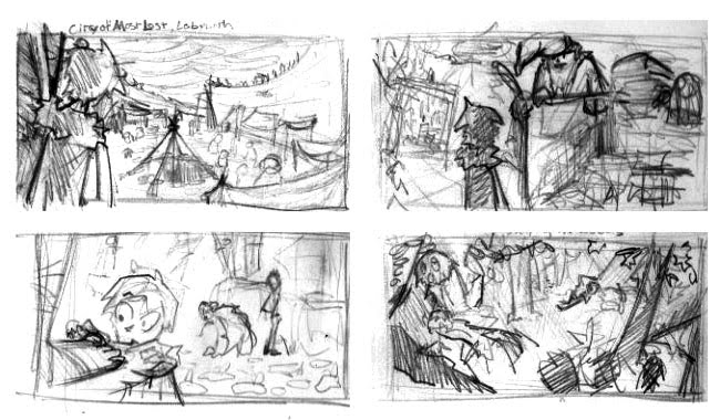
I've made thumbnails! Top left, Dendrul is looking out onto an encampment inside the labyrinth he is lost in. Top right, facing some intimidating wizard dude in a complex library. Bottom left, gazing at a statue's foot as it meretriciously turns to flesh as other characters are distracted in the bg. Bottom right, sleeping in the background in a forest with an awesome owl in the foreground. What do you guys think i should go with? My goal is to complete the painting this weekend.

Next on my to do list after the painting is updating bearrex (shock) again. I'd like to do him in a traditional media graphic style a la Mary Blair.

Thanks guys, any words are appreciated, and feel free to call.
ps. Christina, i realize i am it in phone tag.

Thursday, September 2, 2010

Super Post!

So, at the beginning of the summer, I decided it would be a worthwhile venture to try and read everything on my shelf of 'I Never Got Around to Reading This/I Started This But Never Finished' books. I was gonna start with The Lovely Bones, but about 60 pages in, all I could think about was how awkwardly horrible the Peter Jackson adaptation was and decided maybe it would be best to stop.

And then I saw it. My bound collection of Pullman's His Dark Materials series. I started reading The Golden Compass three years ago, but stopped halfway through because I was foolish enough to try and power through it during a super busy quarter. Oh, and also because the cover is SO GODDAMN UGLY.


Is this not the ugliest thing you've ever seen? Uhm, excuse me. I was referring to the book cover.


Anyway, I decided that if a cover is so frustratingly ugly that it prevents me from wanting to read the book, it might be in my best interest to redesign it. So once I finished the series, my first order of business was to sketch out each of the characters I wanted to feature in the cover. Unfortunately, life kinda got in the way of this project, so I only have three done.


First we have Iorek Byrnison, the rightful king of the Panserbjorne who pimp-smacks the jaws of his opponents clean off. I drew this while riding in a car (and my dad is not the smoothest driver), so some of it is a little rough. Namely his feet. Those damn feet.


Next up is Nameless/Gracious Wings, one of the many ugly-ass harpies who guard the underworld. I gave her this wicked liver-spot on the top her head, but when I drew in her hair, I had to cover it. It looked too awkward without hair on that part of her head. Not gonna lie, I cried a little. It was a really good liver-spot.


Lastly, we have Serafina Pekkala and Kaisa, witch queen (and all around fierce bitch) and her snow goose daemon. No, I did not intend for her to slightly resemble Alanis Morissette. And that's not ironic, so don't even think about making that joke.

I also found my color comp from when I tried to make a cover for this back in Power's Materials + Techniques class, and decided (since it sucked inordinate amounts of butt) I would give it a facelift (i.e. fix the color and put in loads of superfluous detail to try and cover up how awkwardly disproportionate the drawing is) to try and make it match with the new character designs I did.


This comp features Ms. Coulter, Lyra Belacqua, and their daemons The Golden Monkey and Pantalaimon, respectively. As you can see, the one on the left is just a hot mess. Maybe I was scared of blending colors three years ago? Lyra's prominently blushy cheeks makes her look like a Victorian Era prosti-tot, and apparently Ms. Coulter has a hickey. Anyway, this also features three of the limited amount of things I liked about the movie: Ms. Coulter's hairstyle, her claw-like fingernails, and her daemon's Reverend Al Sharpton-esque hairdo.

So there you have it. I still intend on doing more characters and eventually making the cover one day, but I guess right now my primary focus is getting employed so. . . this is on hold temporarily? We'll see.

Oh, and by the way, has the world gone mad?! Am I, Chad 'avoided-making-a-post-for-a-whole-year' Jacobs, really the one keeping this blog alive? Preposterous. Remedy this.

Tuesday, August 3, 2010

The (much delayed) start of something beautiful...

No, your eyes do not deceive you. I am making my very first post. It only took me what, a year? More? Whoopsie.

I have not been so successful on this grand job safari, so to keep me from slipping back into a comatose state of misery and my brain from hemorrhaging any more than it has already, I decided to make fun fun fun projects for myself. Projects such as: redesigning book covers that I hate, reworking old pieces that I thought turned out unsuccessful (so, uh, everything from Portfolio amiright?), and revisiting things that I drew inspiration from during my artistic development.

But before we get to any of those, I thought I would give you guys a present. You know, because I've been so bad with keeping this updated. I guess I'm like a workaholic father who thinks he can buy his children's love with gifts. Anyway...


Yes, it's 100% amazingly accurate depictions of us. Why? Because you are awesome and I miss you guys. Souper Coollective indeed.

Keep your eyes peeled for more stuff in the near future.

P.S. Brendan, your T-Rex with a bazooka is magnificent. Stop making me love you.

Thursday, July 29, 2010


So this is the first piece that I've taken to finish since I've been home and it felt pretty good. It's nothing too inspired... I really just wanted to draw a llama. The original is going to be donated to a charity event where it will be auctioned off to raise money, but I get a great self promo opportunity so everything's good.

Friday, July 23, 2010


Coolest drawing I have ever drawn. This one's for you, Chad.

Friday, July 16, 2010


Huzzah! I've been going to the zoo. Also, a drawing of a room.

Thursday, July 15, 2010

Rose

In progress: I am trying a process update - pen work with digital coloring utilizing pastel textures created by moi. Any thoughts? Technique-wise especially..

I am going to do my "be sure to stop and smell the roses or they might get angry and steal your noses" story as a sequential single--page piece (so... 24 panels MAX).. some color some simple black and white. I want to display them large in a group show im doing in a month here in nyc.

Tuesday, July 6, 2010

So... here is some character/ environment design stuff that I've been working on that relates to a story I'm writing. Also, Brendan and Chad need to get their acts together... just sayin'.


Wednesday, June 23, 2010

Let's Get Motivated!!!

Here's some random stuff from my sketchbook... more to come in a few days :)

I think I may have been channeling Annelise with the shark....


I think some or all of you have seen the jellyfishies because I did it at the end of last quarter, but I put it up anyway.

Tuesday, June 22, 2010

Beebole Concept Art

About a silly simpleton who loves to make merry in a kingdom where joy is forbidden by a King with some serious baggage. This is a concept package im working on with a film guy named David Davis who is almost done with scad.